



You've done this before. You pick a color on a screen, it arrives, and it's nothing like the photo — too yellow, too gray, too shiny. Now it's on your bed and you're just living with it.
Bamboo makes this trickier than cotton, for a reason worth knowing before you order.
Why bamboo photographs differently
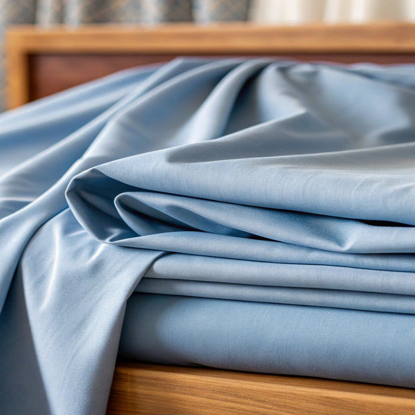
Viscose from bamboo has a smooth fiber with a soft sheen — closer to silk than to cotton. That sheen picks up whatever light is in the room and reflects it back. The same sheet reads cooler under daylight and warmer under a bedside lamp, and neither one is the "real" color.
So the useful question isn't "what color do I want?" It's "what light is this room in?"
Start with your light, not your palette
- North-facing, or not much daylight. The light runs cool and blue. Warm neutrals hold their character here. Cool grays can go flat and a little cold.
- South-facing, or bright most of the day. The light runs warm. Cooler tones stay crisp instead of drifting yellow.
- Mostly lamplight in the evening. Everything shifts warmer. If you really only see your bed at night, choose for lamplight — not for the daytime photo you're looking at.
Our colors, honestly
- White — the safest choice, and the one that shows the sheen most. Reads clean rather than clinical, and goes with everything.
- Ivory — white without the coldness. Usually the better pick than white in a low-light room.
- Taupe — an earthy, muted neutral, and the most forgiving color we make. It hides everyday life better than white and doesn't fight a palette you already own.
- Silver — a true cool gray. Beautiful in a bright room; can read flat in a dim one.
- Slate — deeper and moodier. Makes a bed feel anchored, but it needs some light in the room or it goes heavy.
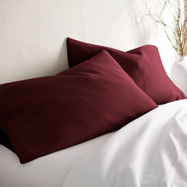
- Emerald Green, Royal Purple, Ruby Red, Tiffany Blue — the saturated ones. Bamboo's sheen makes these read richer than the same shade would in cotton, which is a real advantage if you want color, and a real risk if you don't. Best as a considered choice, not a default.
Building it out
Pick one neutral as your base and let it cover the most surface — fitted sheet, flat sheet, duvet cover. Then bring in a second tone through pillowcases or a throw.
Two tones and one texture is usually enough. Three competing colors is where bedrooms start to look busy, and it's much harder to walk back than it is to avoid.
If you want depth without adding another color, use the same shade in different weights — sheets, a comforter, a knit throw. Same tone, different textures. It reads considered rather than matchy.
A practical note on layering
Bamboo's whole advantage is that it breathes. If you pile a heavy synthetic blanket on top of it, you've undone the reason you bought it.
Layer with things that breathe — bamboo, cotton, wool — and keep synthetics to the end of the bed, where they're decoration rather than insulation.
Two things that matter more than color
Get the size right. Deep mattresses and adjustable bases are where most fit complaints start, and no color rescues a sheet that won't stay on. If you're on an adjustable base you likely need a split size — check the size guide before you pick anything else.
Ignore thread count. The industry has spent years telling you higher is better. It isn't. Higher thread count means a tighter weave, and a tighter weave traps heat. Our Signature is 300 thread count — the number that breathes.
Where to start
If you genuinely don't know, start with Taupe or Ivory. They're the most forgiving across the widest range of rooms, and neither will fight anything else you own.
Shop the Signature Collection — or take the sleep quiz if you'd rather start from how you sleep than from how it looks.

